final draft brand evolution
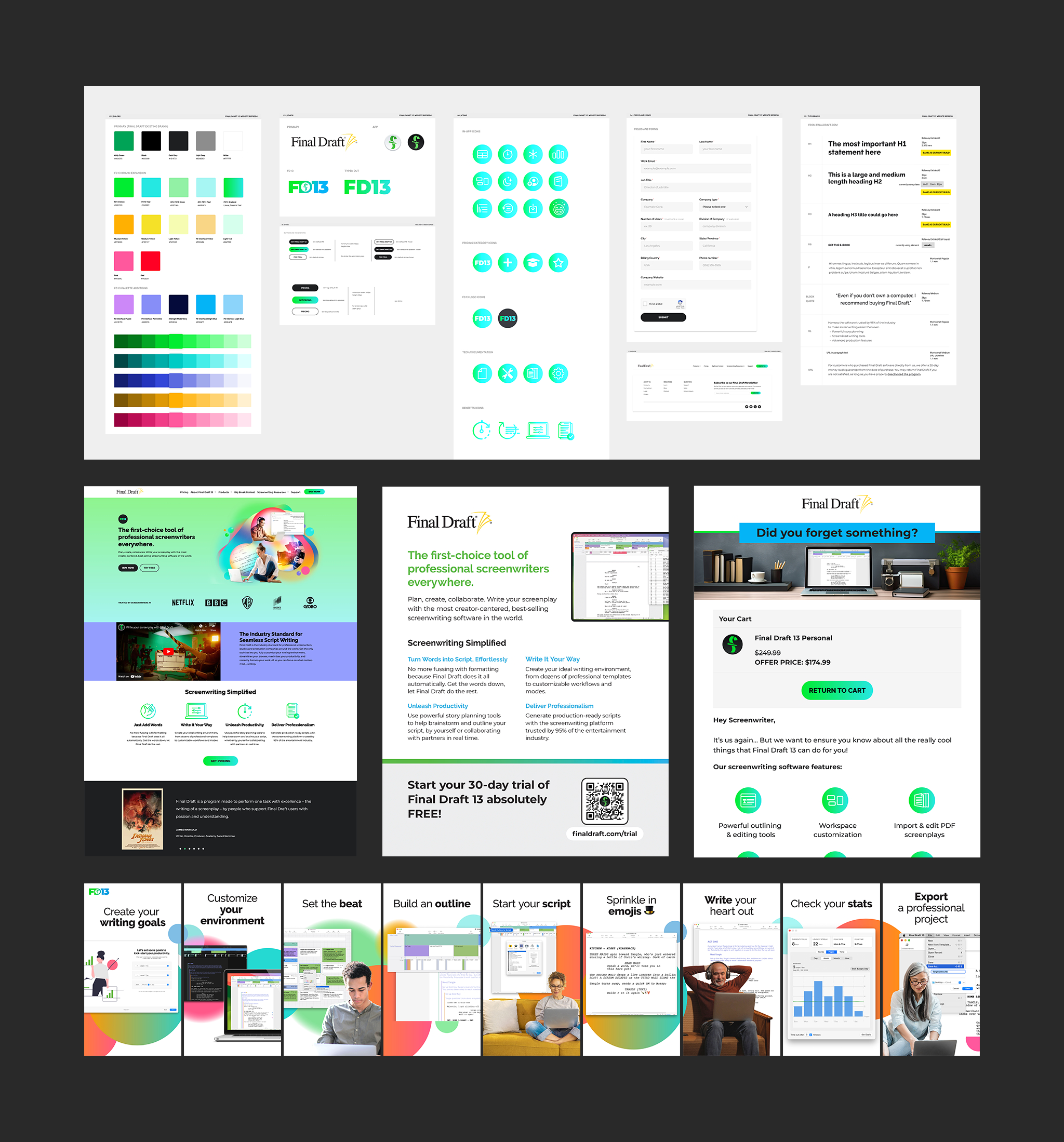
When I joined Final Draft as the only designer on deck, I suddenly had huge responsibilities placed on my shoulders. I was my own senior. I got to call all the shots. Seeing the lack of design parity and clear standards, it was high time for a concrete design system.
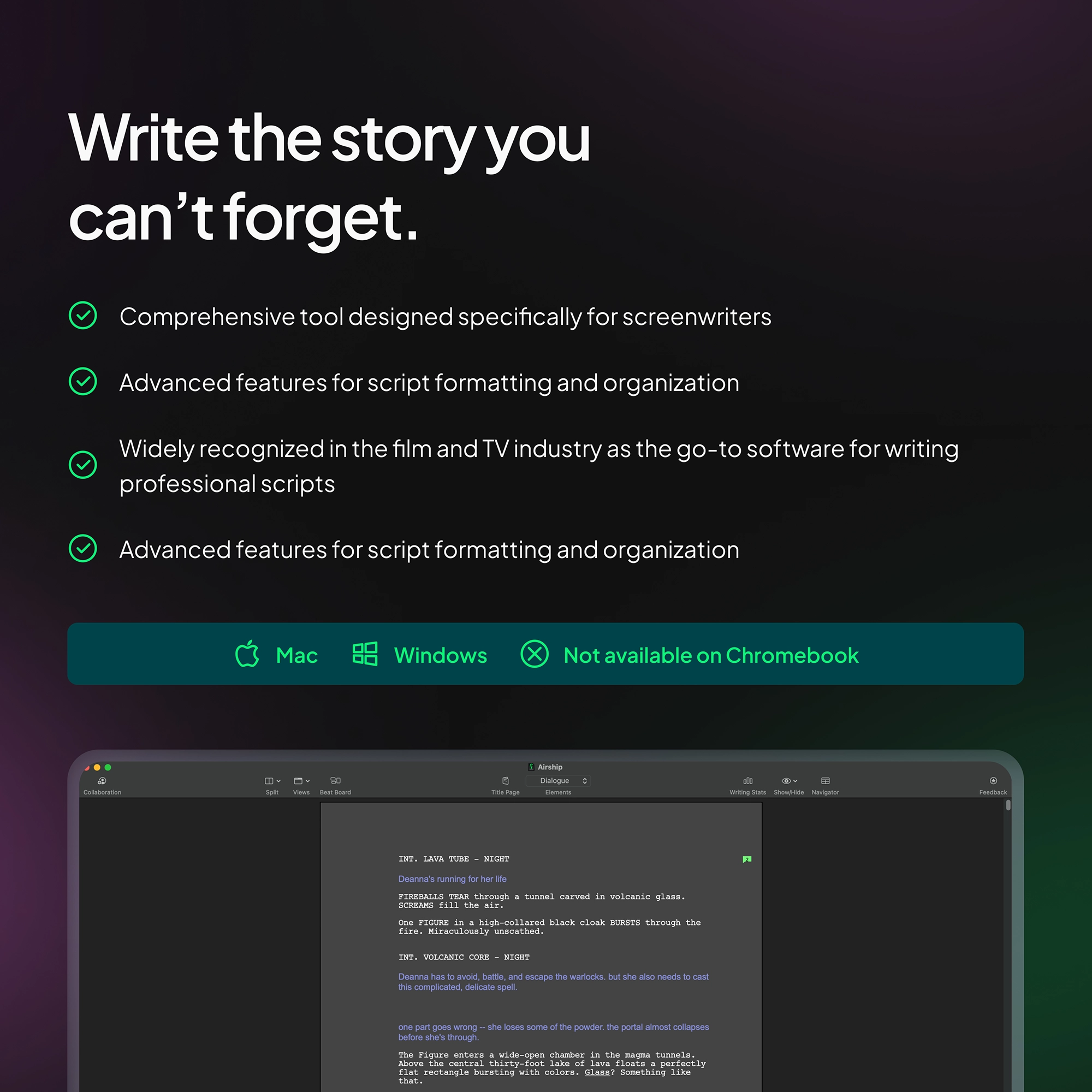
Final Draft is evolving far beyond its roots as a popular screenwriting software. To kick-off this evolution was a rebrand, a major visual reset landing on a minimalist, thoughtful, bold design for a clean break from an overstimulating image of the past. This brand shift is helping to reposition the company as a modern leader among the screenwriting community, soon to emerge in the ever relevant SaaS product space.
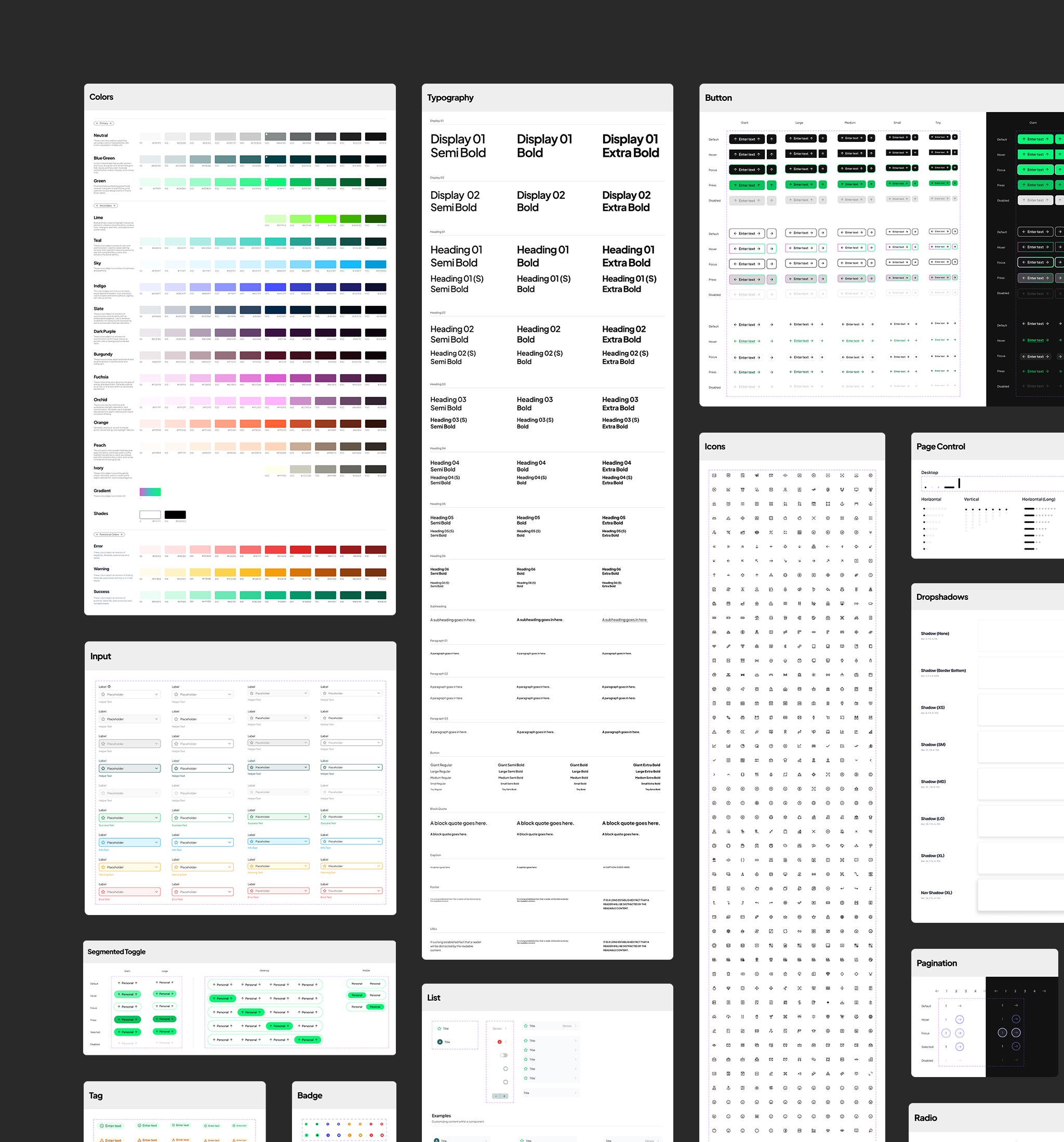
The new design system streamlines workflows, makes start-to-end deliverable times faster, standardizes the usage of reusable components and font styles, and implements standard base spacing units and font hierarchy. This project prioritized scalability, future cross-team collaboration, accessibility, and inclusive user experiences and was a true labor of love.
